GOOD ADVICE
7.5” X 9.5”
With contributions from multiple professionals across the design industry, this book required a visual identity that could unify diverse voices while standing out on shelves and in classrooms.
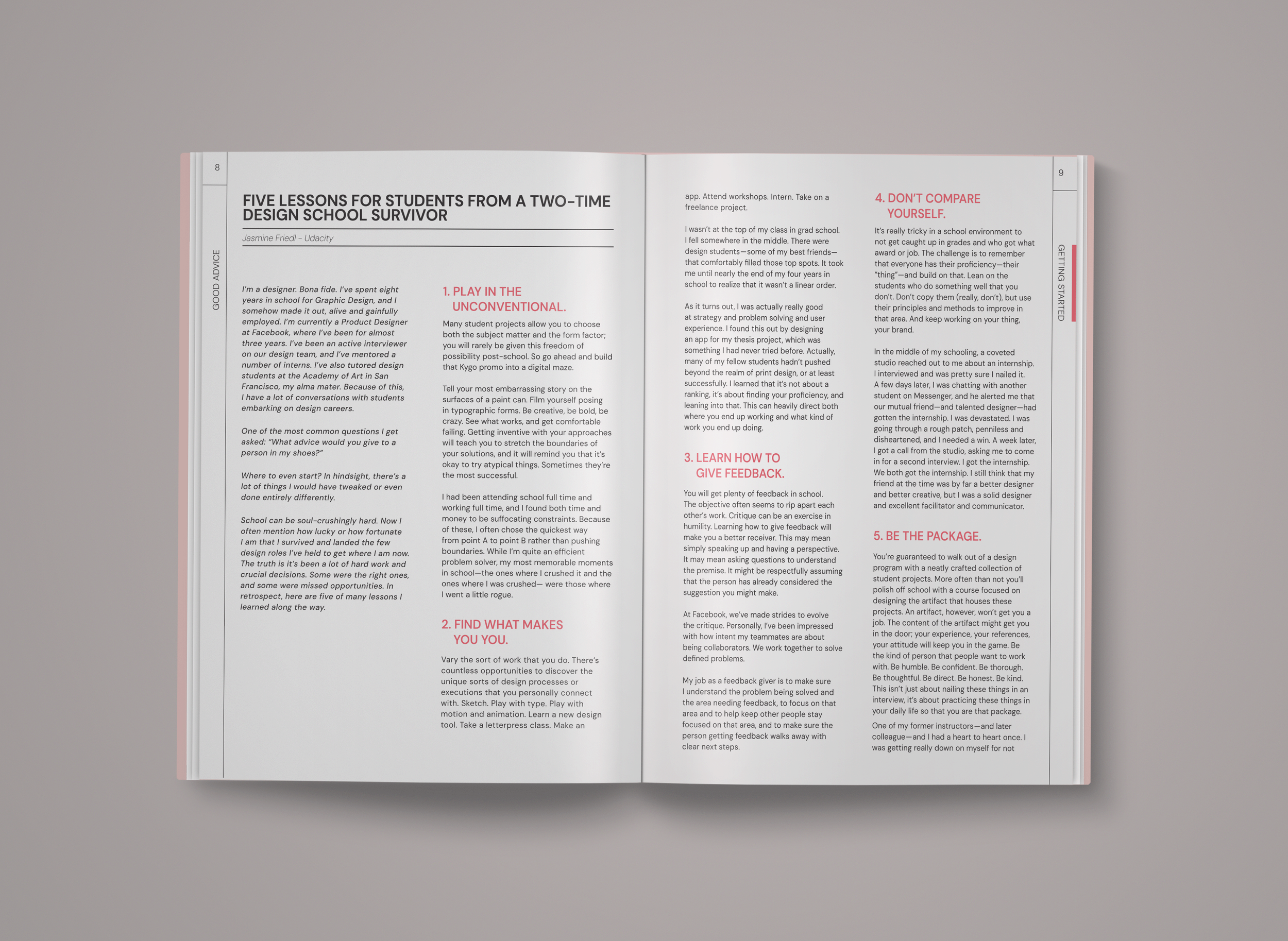
Experimentation with crumpled paper, a visual metaphor for the trial-and-error nature of creative careers, ultimately led to the final cover design. Clean, structured typography. Inside, I developed a layout system that balances cleam, structured typography with colourful ties to the front cover.
The final book is visually engaging and highly readable, capturing the spirit of mentorship and experimentation that defines a designer’s early career.